Writing for Clarity: UX Work That Helped Eurowings Scale Their Android App
A quick UX teardown, some product-led growth, and one quietly effective app update - here's how I helped a European airline get 1M+ downloads.

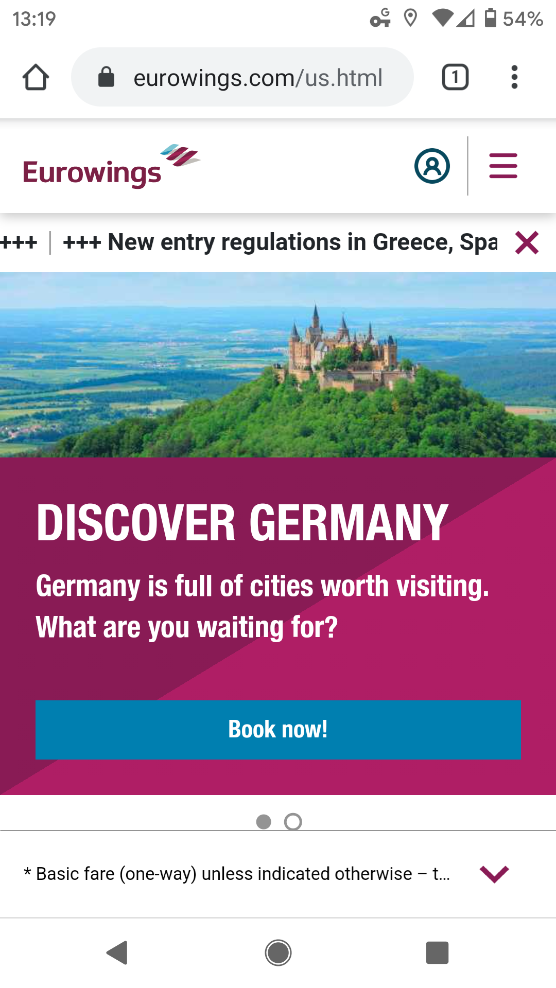
A few years ago, I did a short consulting engagement with Eurowings, a German low-cost airline under the Lufthansa Group umbrella. They were in the process of updating their Android app, and asked me to give feedback on the existing mobile web experience, which was - let’s be honest - deeply unusable.
The Problem
Their mobile booking interface was clunky, unintuitive, and full of friction points. Essential actions (like selecting flights, entering dates, and understanding pricing) were buried in poorly styled, non-responsive web forms. CTA hierarchy was off. The UI didn’t scale or communicate urgency clearly. Basic design hygiene was missing.
In a context where users are:
- Booking last-minute flights from a phone
- Dealing with stress, timezone gaps, and slow data
- Making high-stakes, high-velocity choices
…the friction was unacceptable.
My Contribution
- Teardown: I provided a UX audit of the existing site - calling out issues in copy, layout, and decision logic.
- Flow Redesign: I mocked up a mobile-native booking flow based on best practices in airline UX and behavioral science (minimal input load, progressive disclosure, zero-friction CTA logic).
- Product-Led Guidance: I highlighted ways the experience could guide user behavior through interface clarity rather than forcing conversions through persuasion.
It wasn’t a massive engagement - just a few rounds of feedback. But they listened.
What Shipped
A few months later, Eurowings launched a new Android app that reflected many of the structural changes I suggested:
- Simplified departure/return UI
- Clear, tappable buttons
- Focused hierarchy on core task flows
- Cleaner visuals, better affordances

Today, the Eurowings app has:
- 4.6 stars on Google Play
- 1M+ downloads
You can see the app here.
Why It Mattered
Good UX isn’t just about aesthetics - it’s about operational clarity.
When mobile funnels are clean:
- More users book without bouncing
- Fewer customer service issues arise
- The brand builds trust before checkout
This isn’t flashy work. But it’s high-leverage.
Reflection
Sometimes your best work shows up months later - in a feature rollout, a ratings boost, or a smoother customer experience.
And sometimes it’s just knowing that a team halfway across the world quietly shipped something better because of your nudge.
Want a second set of eyes on your app flow or funnel logic? Reach out here.